YUPI
A new identity and site structure built around how people actually want to help.
- UX/UI Design
- Graphic design
- Visual identity
Context
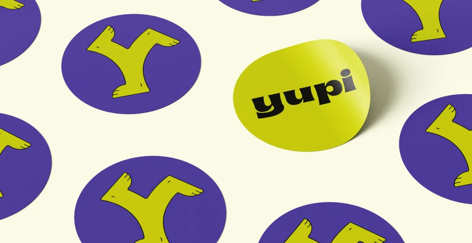
YUPI is an Association for Social and Community Development. This was a full rebrand, logo, stationery, social templates, done in partnership with designer Marisa Espinheira, plus a website redesign.
I led research, information architecture, and UX/interaction design; Marisa led visual identity.
The goal
Design and develop a visual identity and a website that reflect the maturity of the organization's work.
Research
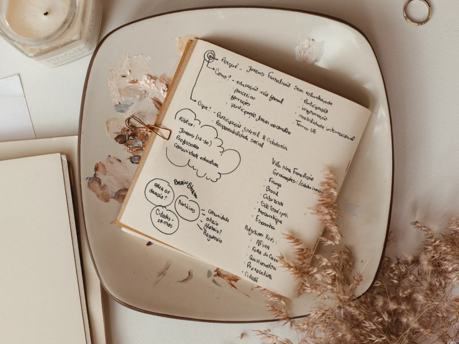
Research started internally: discovery sessions with the organization to map goals, audience, and pain points, plus a Golden Circle exercise (Why / How / What) to nail down the brand's purpose before any visual work.
This surfaced three distinct audiences the old site never separated: volunteers, training participants, and partners/funders.
We also mapped comparable partner and inspiring organizations to see how they structured navigation and presented team and projects, confirming a warm, human visual direction over anything corporate.
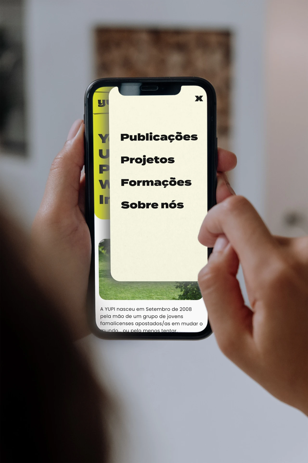
New IA
Consolidated 6+ scattered items into 5 menu items grouped by user intent instead of the organization's internal structure:
Home · About (org, team, mission) · Projects · Publications · Contact (volunteering, testimonials, past events).
Hovering over each navigation item reveals a quick preview of that page's content, similar to the dropdown menus on clothing e-commerce sites, so people know what's inside before clicking. This helped testers understand the site's structure upfront and avoid spending time on sections they weren't looking for.

Outcome
YUPI ended up with an identity and a site that speak the same language: an IA organized around what people actually want to do, not the org chart, and a design system the organization can extend on its own.