Homemade sweets rebranding
Brand design built around its founder
- Graphic design
- Illustration
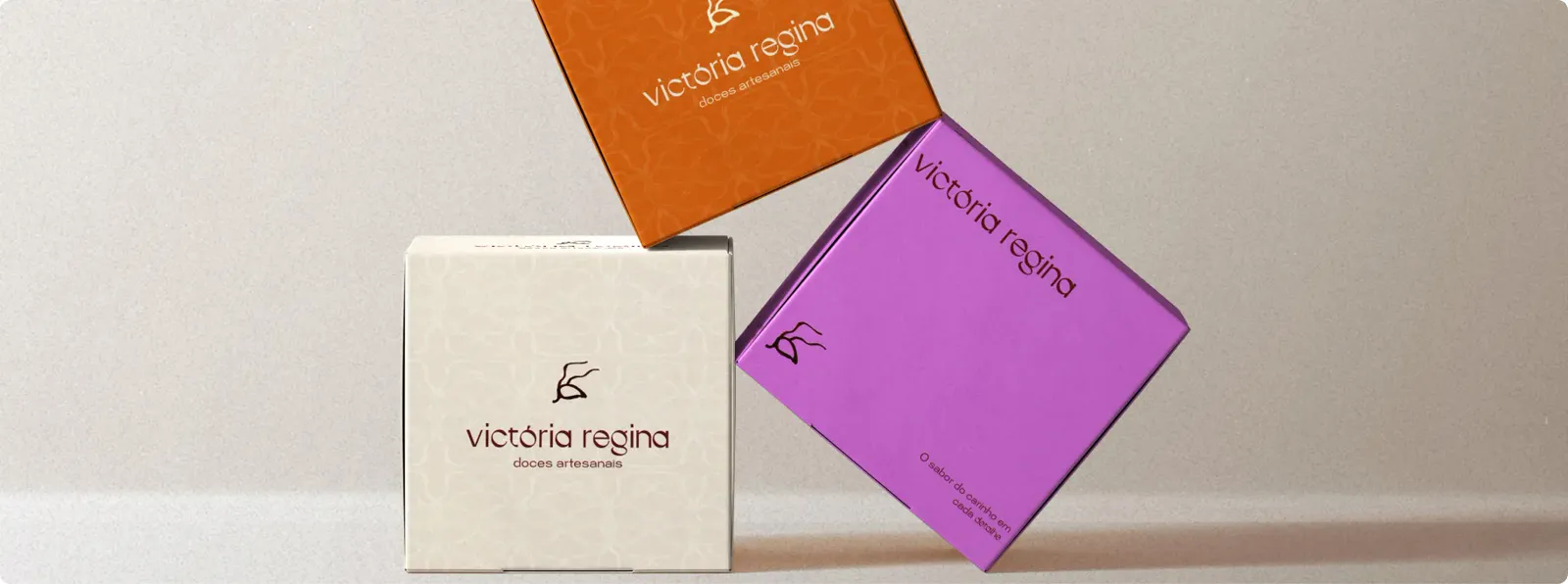
The brief
Trufas VR had a name that was holding it back. The founder felt it boxed her in. It shouldn't be just chocolate, shouldn't be just truffles.
Victoria makes everything by hand, from scratch, and she wanted a brand that could grow with her ambitions without losing the handmade soul that makes her work special.
The idea
Build an identity that feels sophisticated, but never loses the warmth of something made by one person who genuinely cares.
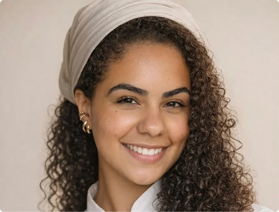
The founder
Every decision in this rebrand started with one question: who is Victoria?
She's present at every stage — she bakes, packages, delivers, and shows up on social media. The brand is her.
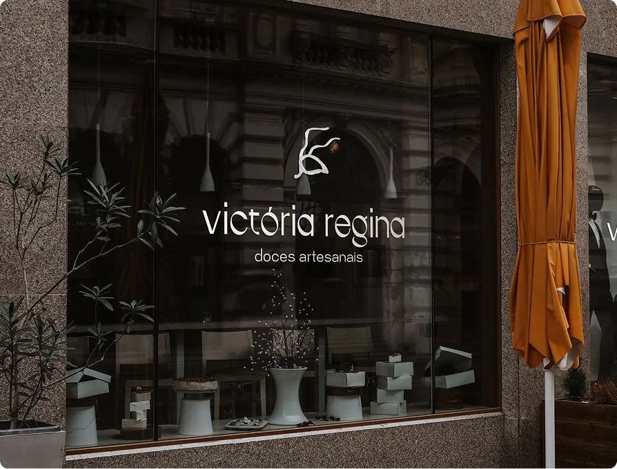
So the new name couldn't be an abstraction. Victória Regina, her own name, was the answer. Personal enough to feel handcrafted. Strong enough to one day be above a boutique door.
Research & process
Weeks of market research, competitor analysis, and founder interviews before opening Figma.
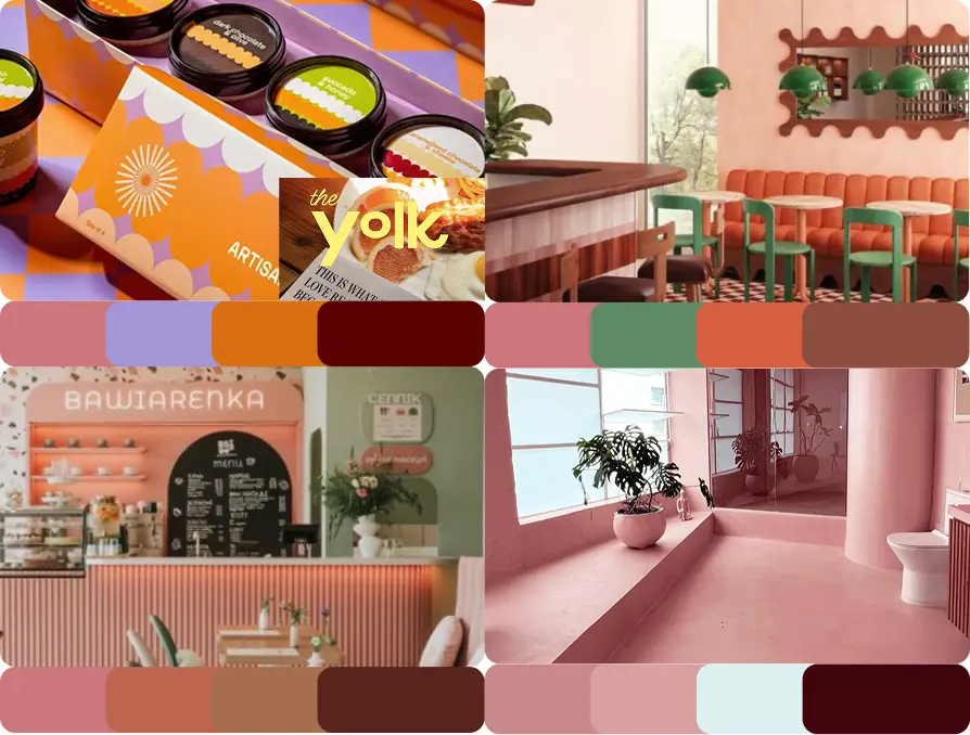
Three moodboard directions were presented to align on aesthetic. From classic and sophisticated to modern and friendly.
A brand personality mapping exercise helped Victoria articulate what she wanted and, just as importantly, what she didn't: no low contrast colours, nothing that felt generic or mass-produced.
Design decisions
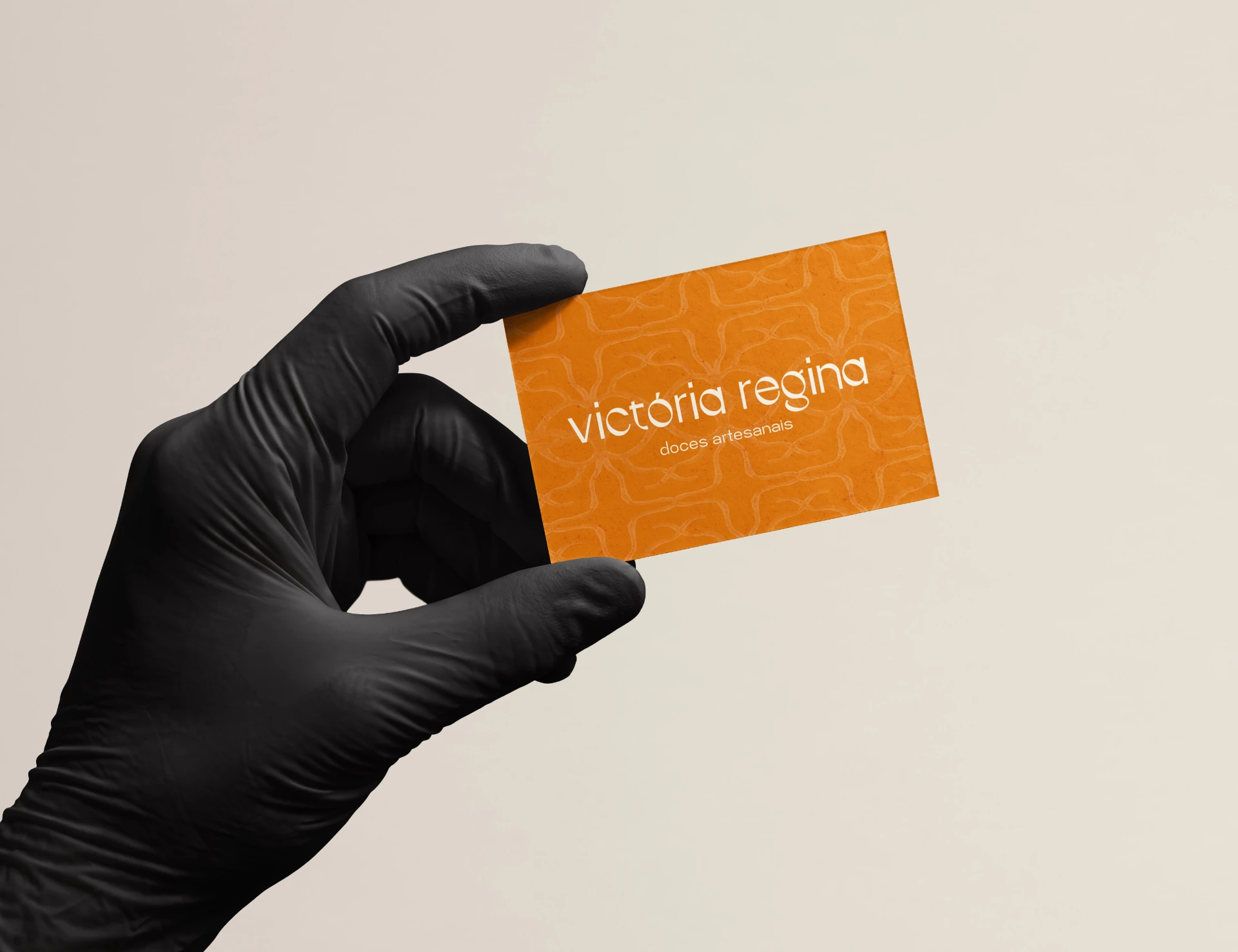
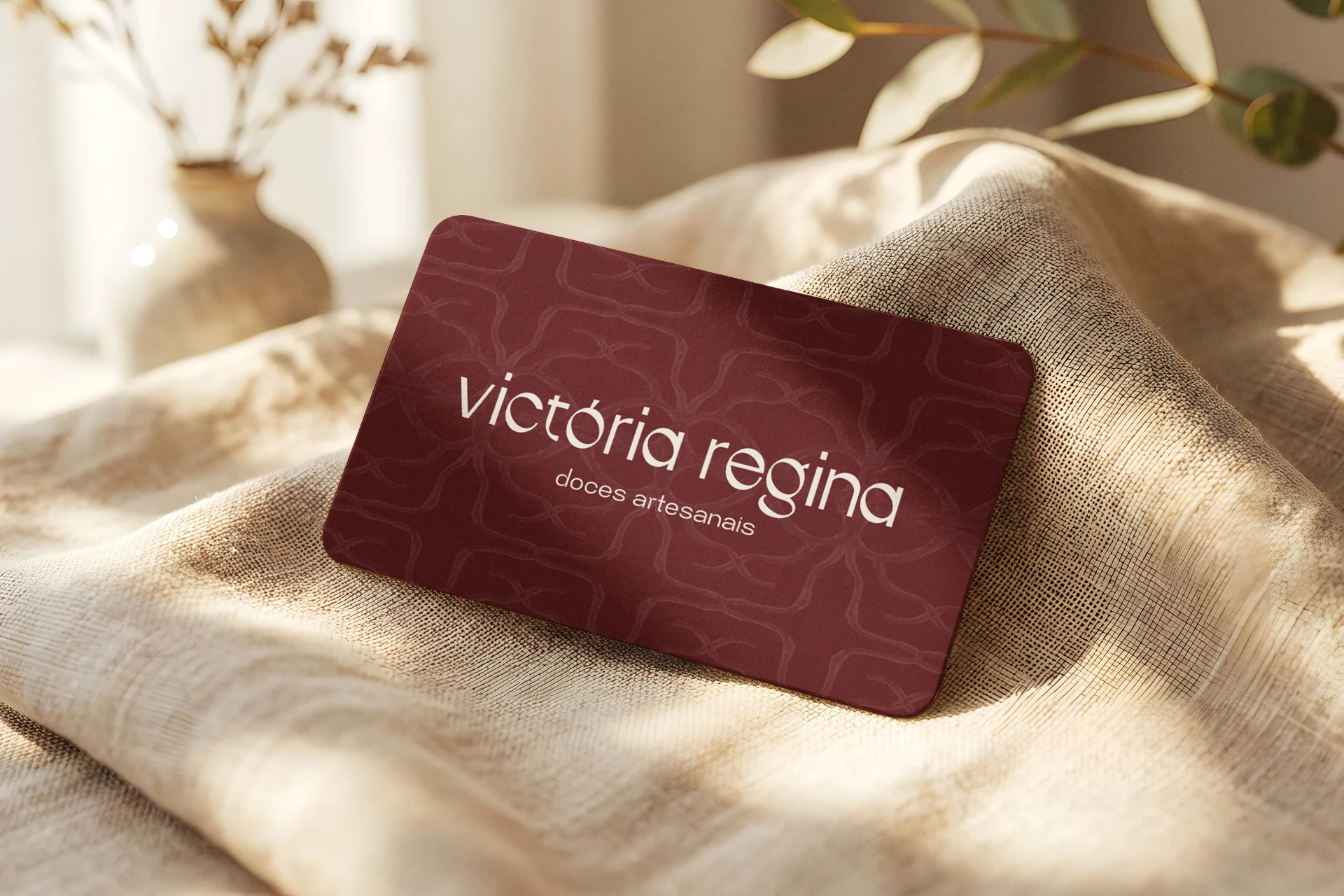
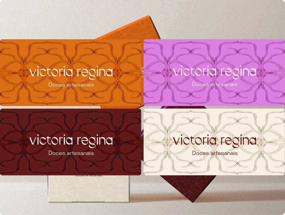
The colour palette moved away from the light, dull tones Victoria described as feeling “flat and lifeless”, toward a vibrant set of four: lilac, burnt orange, deep burgundy, and warm cream.
Each colour can stand alone or combine, giving the brand flexibility across packaging and seasons.
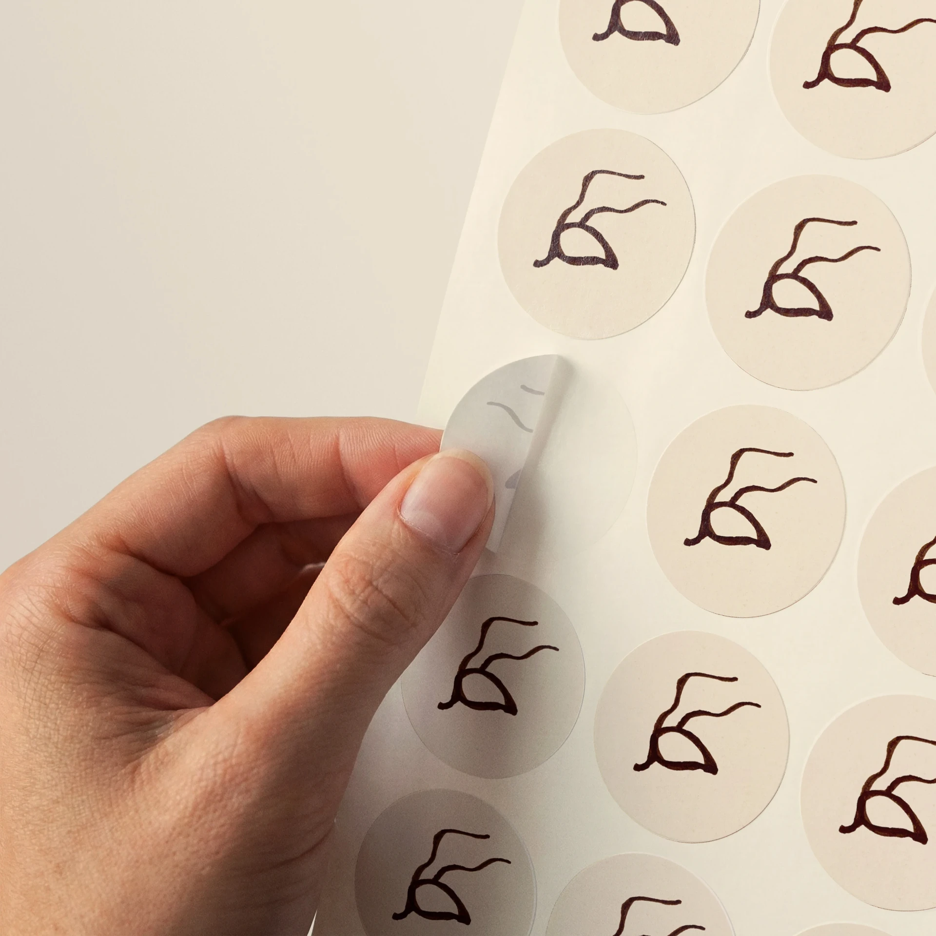
The ant icon was hand-drawn as an illustration. It carries a double meaning: Victoria's own metaphor for her ambition — small but determined, working with precision toward something much bigger — and a mention of how she communicates with her followers, 'formiguinhas', in english: her "little ants."
For typography
IF Durer Display was chosen for its elegant yet handcrafted quality.
It is paired with Mersad for body text — clean and contemporary without losing warmth.
Drawing the mark by hand rather than constructing it digitally kept that artisanal/handcraft quality at the heart of the identity.

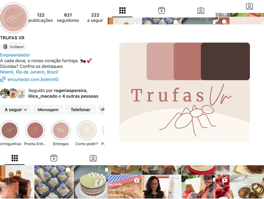
Before & after
From Trufas VR — a name and logo that didn't reflect the full scope of the brand or its founder — to Victória Regina Doces Artesanais.
Same dedication, entirely new presence.
The result
An identity built to grow: refined enough for the boutique Victoria wants to open one day, handmade enough to keep the essence of something crafted by one person who cares about every detail.